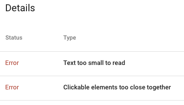
We’ve seen this across sites… error after error resulting in websites being flagged as “not mobile-friendly”. This becomes frustrating for some website owners because Google is often not specific about where the problem is on the page. But, before we get into the actual issues, you have to ask, is it worth my time to fix?
Why you need to fix mobile site issues
Should you care about the mobile site issues? ABSOLUTELY! There are multiple reasons to be concerned. But the biggest is it can kill your organic site traffic.
Google has switch most sites to Mobile First Indexing. So, however your mobile site is assest will impact the organic results of your desktop version as well. Since getting mobile right is harder than desktop, a bad mobile experience will sink your SEO ship.
And, it will get even worse. Google search is moving to Core Web Vital roll out. When this happens, your mobile experience will have even more impact on your overall SERPS, and it will be harder to acheive good marks on your mobile score.
For now, the good news is your site isn’t the only one that sucks. This is part of the reason most sites haven’t tanked yet. But, as site owners start addressing the mobile issues, they will have the advantage, and take the top SERPS.
So, don’t wait to address the mobile issues. If your one of the first, you’ll gain an advantage.
What are the most common mobile site issues?
There are a lot of elements Google will use to judge your website. And the prioritization of the elements will likely change over time… without any warning from Google. For now, here are the issues we see most.
Text On Page Too Small
Virtually every site not developed in the past year gets this warning, and most recent sites do to. This is a tricky errror to pinpoint.
The general guidline is that text on the page should be 16px or larger. If your CSS font size is always set as px, then the fix is pretty easy. Just find the font-size in the css and change anything less than 16px to 16px. Or is it that easy?
Two issues arise with this.
First, CSS font-size can, and often (should be) set with a relative measure (em for example). This was a cornerstone in responsive design. As the screen size shrinks, so does the font size. On mobile, this means it can be the equivalent of less than 16px. But, you won’t see that in the CSS. You have to use the inspect tool on Chrome and look at the rendered size.
Second, even if you can go through your CSS and change the font-size to 16px or larger, are you sure it will play well with the design? There is a reason designers made fonts the size they did. If you just push up the size of some copy, then you impact the layout and proportions of the page. Does this still work?
Clickable elements too close together
We see clickable elements too close together most often on menus, but it can happen anywhere. Google wants there to be 48px of clickable area. The motivation is to improve accessibility for users.
The most common fix for this is to add padding to the elements to expand them to the minimum size.
The fix for this issue also has implications for design and rendering. The sites were originally created to look a certain way, and if we’re honest, designers rarely thought about clickable area. Simply adding padding to clickable areas may be an easy technical fix and put you in good position for Google, it may create a problm on your site.
When looking at the scope of fixes need to meet Google’s Core Web Vitals, and the mobile test, you may find simple fixes are so simple. But, start with a staging area and make an initial round of changes. If the site rendering is acceptable, you can move forward. If not, you may need to reengage a design/front end developer to address the site design issues.

Leave a Reply